Table of Contents
import numpy as np
import matplotlib.pyplot as plt
import matplotlib.cm as cm

n_can = 5
votes = np.random.randint(100, 1000, (n_can, ))

cans = np.array(['A', 'B', 'C', 'D', 'E'])

total_vote = np.sum(votes)
percentages = votes/total_vote*100
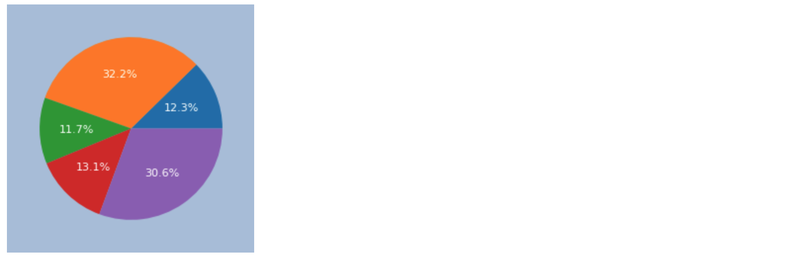
파이 그래프 기본
fig, ax = plt.subplots(figsize=(3, 3), facecolor='lightsteelblue')

ax.pie(percentages)

퍼센티지 표기
fig, ax = plt.subplots(figsize=(3, 3), facecolor='lightsteelblue')

ax.pie(percentages, autopct='%1.1f%%', textprops={'fontsize': 8, 'color': 'w'})
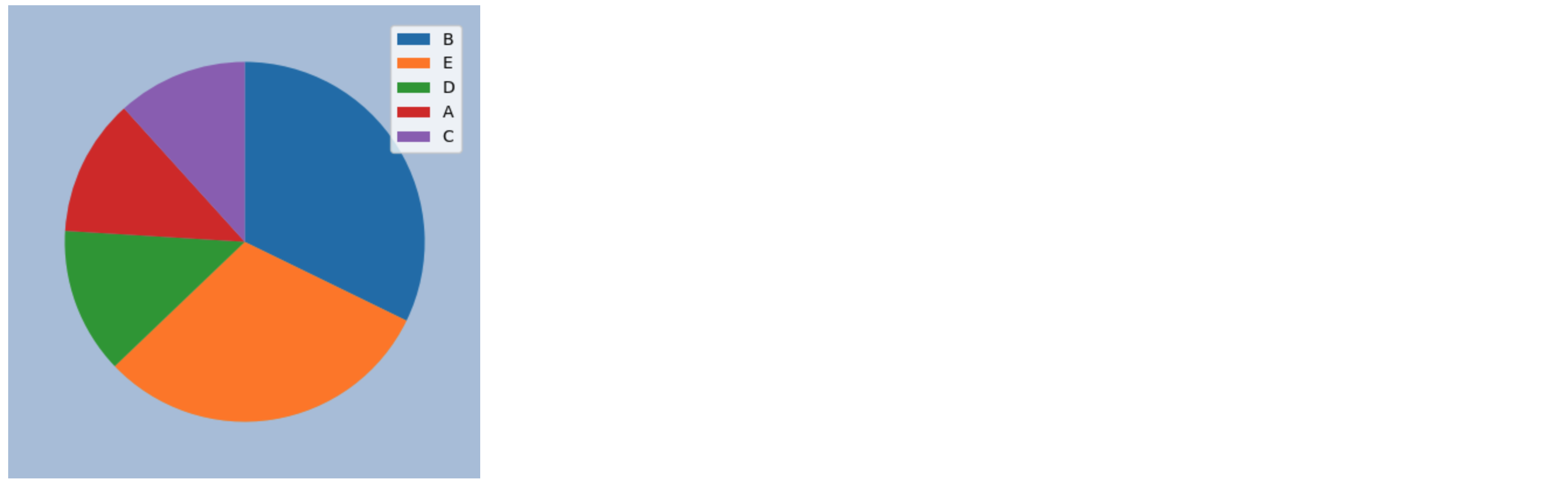
파이 정렬
sorted_idx = np.argsort(percentages)[::-1]
sorted_percentages = percentages[sorted_idx]
sorted_legend = np.array(cans)[sorted_idx]

fig, ax = plt.subplots(figsize=(5, 5), facecolor='lightsteelblue')

ax.pie(sorted_percentages, counterclock=False, startangle=-270)
ax.legend(sorted_legend)
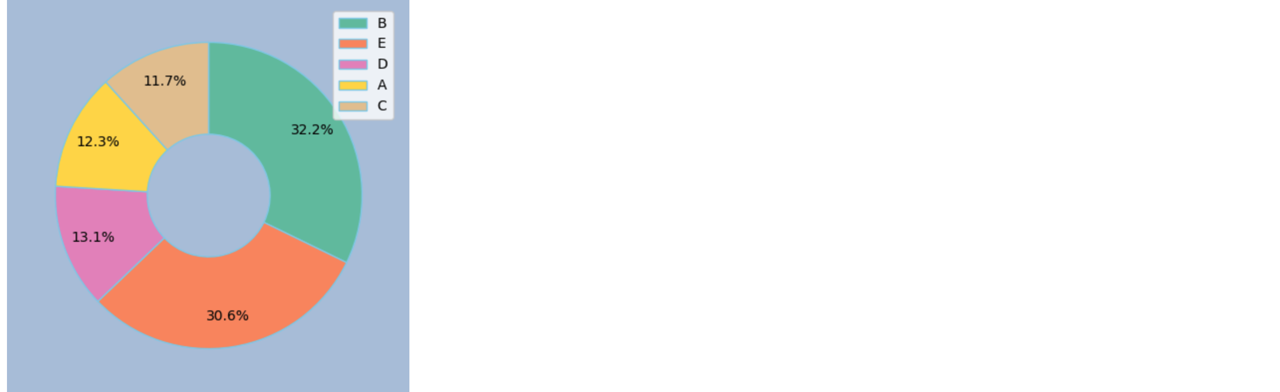
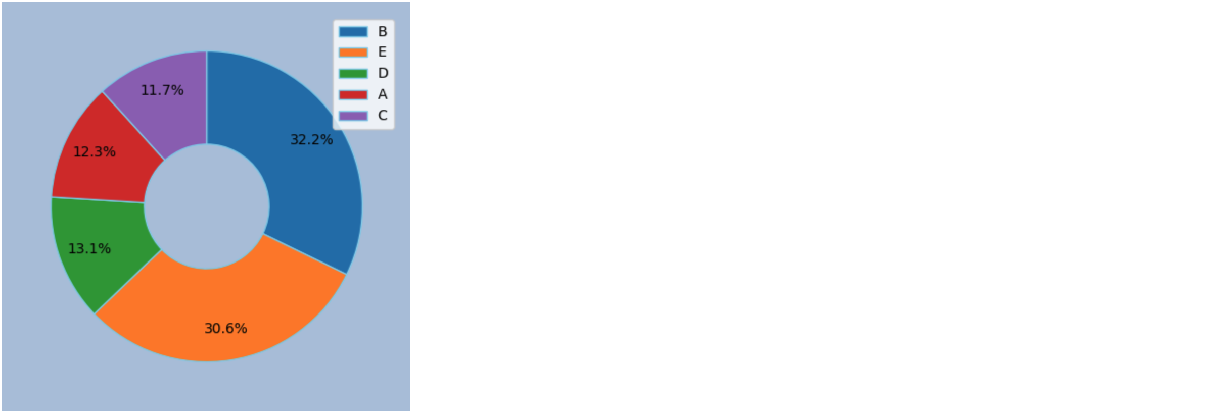
도넛 그래프
wedgeprops = {'width': 0.6, 'edgecolor': 'skyblue', 'linewidth': 1}

fig, ax = plt.subplots(figsize=(5, 5), facecolor='lightsteelblue')

ax.pie(sorted_percentages, counterclock=False, startangle=-270, autopct='%1.1f%%', wedgeprops=wedgeprops, pctdistance=0.8)
ax.legend(sorted_legend)
cmap = cm.get_cmap(name='Set2', lut=20)
outer_colors = [cmap(4*i) for i in range(5)]


wedgeprops = {'width': 0.6, 'edgecolor': 'skyblue', 'linewidth': 1}

fig, ax = plt.subplots(figsize=(5, 5), facecolor='lightsteelblue')

ax.pie(sorted_percentages, counterclock=False, startangle=-270, autopct='%1.1f%%', \
       wedgeprops=wedgeprops, pctdistance=0.8, colors=outer_colors)
ax.legend(sorted_legend)